Interview: Pieter Boels

Pieter in his studio • Antwerp, Belgium
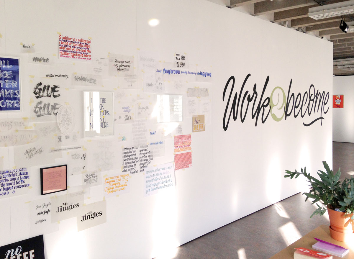
Pieter Boels is a graphic designer and lettering artist with a studio in Antwerp, Belgium. His strong typographic work merges graphic design, calligraphy, digital typography, and illustrative hand lettering. The focus of Pieter's studio is corporate identities, books and catalogues, murals, shop windows, posters, packaging, and even the occasional tattoo.
Pieter received his Master's degree at St-Lucas School of Arts in 2008 and set up his own studio in 2012. Next to assignments, Pieter also works on personal projects, continually exploring new visual techniques. His mantra is that life is too short (or too long) not to have a lot of fun.
This year, Pieter collaborated with fellow type enthusiast Eltipo to found the lettering artist collective Analphabetics. It will focus on creating and teaching lettering and calligraphy, and will host its first lettering class in Antwerp in March 2017.
We are so pleased to welcome Pieter into the Calligrafile team! His background in digital type and sign painting makes him an especially great asset for the intersection of graphic design and calligraphy. I interviewed Pieter via email to find out more about his start in hand lettering, his favorite projects (for clients and on the side), and his (fantastic) advice for combatting creative burnout.
Follow Pieter's work on Instagram, Behance, Facebook & Twitter
Where are you located?
The lovely city of Antwerp: Belgium’s second biggest city – although it’s tiny – and the capital of fashion and diamonds. It has an exceptionally lively creative scene too.
What sparked your interest in hand lettering, and what path have you taken to master the art form since that time (formal training, independent study, a combination of the two)?
Like most children I drew a lot, and I attended weekly art classes throughout my entire youth. I was always conscious about my handwriting, regularly changing the shape of certain letters to something I deemed fashionable or “cool”.
My first steps in hand lettering happened as much because of technical limitations as out of interest. In my first years in art college I loved working on analog undergrounds and textures, and I just didn’t know how else to apply type on them. I experimented with scanning and applying digital type but the results were always underwhelming. Luckily I inherited loads of dry transfer sheets from my parents, relics from their time as interior architecture students 30 years earlier. Great stuff, but at a certain point I got tired of the available fonts, and a lot of the sheets were so old they had lost their adhesiveness anyway. So I started drawing type by hand.


At my first job in a small design studio I tried to incorporate hand written type from time to time. A frustrating experience because most clients were very corporate and not interested in typographic experiments. And if I’m being very honest also because of my lack of skills, which made me give up.
It was only when I went freelance in 2012 that I really got into lettering and calligraphy. I started experimenting with cheap brush pens and markers and slowly got better by looking at other people’s work, subscribing to online tutorials (like Skillshare) and generally practicing a lot on my own. There’s a lot of good books on lettering out there. Two of the best are In Progress by Jessica Hische and The ABC of Custom Lettering by Ivan Castro. I wish I had these when I was just starting out! Nowadays I attend workshops regularly. They are a great way to meet other people, learn new skills or boost existing ones. In 2016 for example I took a two-day blackboard art course, a cursive calligraphy workshop and a brush script workshop.

Analphabetics logo by Eltipo
Recently, my partner in type Eltipo and I started a collective called Analphabetics, where we will focus on creating and teaching about lettering and calligraphy. Our first workshop will be in Antwerp somewhere towards the end of March. Keep an eye out for more on our the Analphabetics Facebook!
Your eye for typography is quite unique, and you frequently combine hand lettering with modern digital fonts As both a graphic designer of some purely digital work, and a versatile lettering artist (doing everything from sign painting to logo design), where do you feel that lettering falls in the spectrum from fine art to design? Do you distinguish between the two?
For me, the difference between (graphic) design and fine arts lies in their respective intentions. When I design I'm usually trying to solve a problem or question that’s stated in the brief. Art on the other hand may convey an idea, raise questions and be interpreted, and is born out of the artist’s mind, therefore not confined to serving a single purpose. Of course there’s often more or less overlap, which is interesting. Lettering inherently means lettering something, so what you’re lettering, the message, determines whether it belongs in one category or the other, in my opinion. In Spring of 2016 I visited Stephen Powers’ exhibition Coney Island Is Still Dreamland (To a Seagull) at the Brooklyn Museum, and the Icy Signs installation there was a perfect example of how an applied art like sign painting can become fine art.
Doing mainly client work I consider myself more a designer or craftsman than an artist, but the more personal projects I start the more those borders become blurry. But why label anyway, right? Although it’s nice to be free in my personal work I do enjoy the restrictions that commissions usually impose, and I use hand lettering in both instances.
As a creative freelancer, how do you combat creative burnout and stay motivated?
So many possible answers to this one. I guess the most important thing is to have a clear idea of what you want to achieve with your business. In other words having a plan, a mission, vision or whatever you want to call it. Whenever times get rough – and sooner or later they always do – it’s good to have something to hold on to, a compass pointing you in the direction of your long-term goals. It can be hard to formulate such a plan, especially when you start out as a freelancer, and it requires absolute honesty. So here are three other, easier rules I have applied over the past years.


VARIETY
For me it’s important to work on several things at the same time. At any given moment I have at least ten projects on the table, some of which are self-initiated. When I get stuck at one project I can easily pick up another (preferably very different) one. Of course deadlines often dictate some order of urgency, but even then it helps to switch between projects to keep a fresh eye on the matter. Variety also means not doing too much of the same work for long stretches of time, and often trying new things. Be it writing copperplate invitations, painting signs or vectorising lettered quotes, if that was all I did every day I would soon throw myself out of the window. But evidently that is a very personal thing. The feeling of acquiring a new skill or successfully finishing a first-of-its-kind project is hard to beat and gets me going for at least a few weeks.

WORK WITH PEOPLE, NOT FOR
One of the quickest ways into creative burnout is feeling like a tool. I have no problems with a restricted brief or following brand guidelines, but if a client merely uses me to execute his or her ideas, then our relationship is doomed to be short-lived. As a designer I need creative participation. The end result always benefits when my client and I work together as a team. It also creates loyalty from both sides which makes burnout and frustration much less likely to happen. Going the extra mile for an appreciative client is easy!
GO OUT AND RELAX
Huge cliché but oh so true. During busy times it can be tempting to lock myself up in my studio like a hermit, working long days and eating behind my desk to save time. However effective it can be at first, after a while I always end up feeling miserable and looking at Pinterest and Instagram for hours, killing my creativity (not to mention my efficiency). Inspiration often comes in unexpected forms so it’s super important for me to go out into the world and connect with others.
What is the most fun, unusual, interesting, or difficult commission you’ve worked on to date?
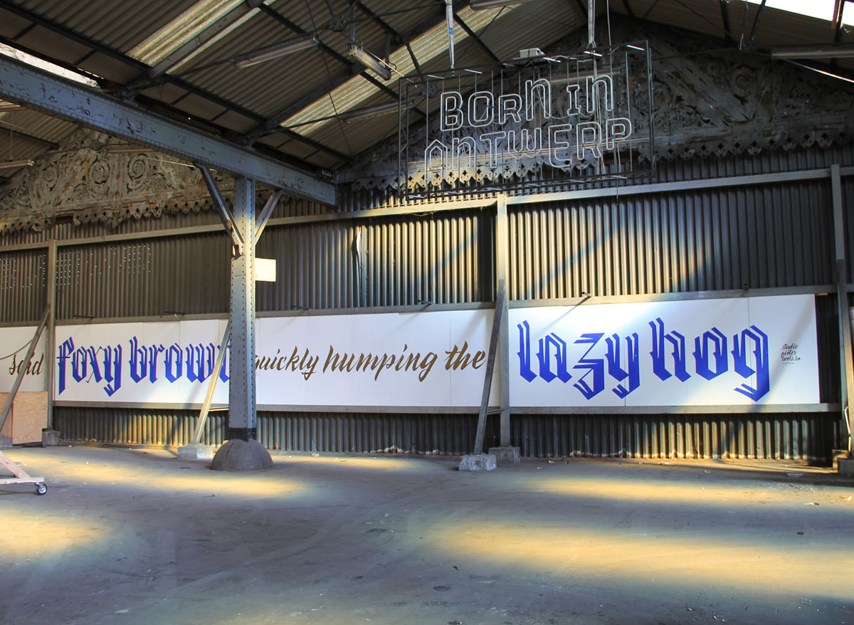
Antwerp is home to the Museum Plantin-Moretus, which houses one of the world’s oldest existing printing presses and was the first museum to ever become a Unesco World Heritage Site. After a renovation it reopened in October 2016 and I was asked to do a typographic performance during the opening weekend. I chose to write a Medieval poem on the bars and shop windows on the square where the museum is located. (See below.)
Blackletter seemed fitting, as a reference to the time when the poem was written and printed. I had used this style in calligraphic projects before, such as table seating, but never on anything else than paper. Having only practiced on my studio’s windows, it was quite intimidating to start on the first shop window – with the owner, clients and passersby watching my every move. But once I found my rhythm it was one of the most rewarding commissions I’ve had to date.
It took me three days to do them all and it was an absolute blast. People reacted really well and often came over to talk and ask questions. It was challenging and fun, and the interaction with the crowd gave the experience an extra dimension.


What are the top 5 lettering tools you couldn’t live without?
Hmm. I’m gonna start off with the most obvious: a pencil. More specifically my trusty Staedtler Mars Technico mechanical lead holder. The inseparable Tombow Mono Zero eraser stick comes in at a close second. While most regular pencils and erasers also get the job done, few can compete with the precision of these two. Honorable mention: Palomino Blackwing pencils. Truly fantastic gear, especially for rough sketches and writing. Their smoothness and responsiveness to pressure is beyond comparison.
Next: tracing paper! Although I’m starting to use a light box more often these days, I love the feeling of drawing on those smooth sheets. Slightly heavier tracing paper is perfect for using with brush pens too.
Speaking of brush pens, the Pentel Art Brush pen certainly has a place in this list. It took me a while to master it, and it was so satisfying once I did…versatile and dynamic, plus they’re refillable and last forever.
Adobe Illustrator ends my top five. I’ve always been more into vectors than pixels when it comes to making digital artwork, and the pen tool has been my go-to drawing tool ever since I first discovered (and hated) it in art school.
I’m not mentioning any books or websites although they’ve helped me a lot throughout the years. The tools I mentioned above however enable me to create most of my work, so I’d miss those above anything else.


Do you have a hidden talent or hobby that you don’t usually share?
It’s not a secret to people who know me, and it’s certainly not a talent, but I’m pretty big on cars and have been for as long as I can remember. However eco-minded and sustainable my lifestyle is in all other aspects, classic sports cars simply make my heart beat faster. One of my childhood dreams was to own a Porsche before I was 30 (which, as a child, seemed very old). A couple of days after my 25th birthday I bought one in Germany, a 1984 model. I even took a car mechanics night class for a few years in order to do some of the maintenance myself. This summer, my best friend and I are racing it in a rally from Brussels to Budapest.

Molly Suber Thorpe
CALLIGRAFILE FOUNDER & CORE CONTRIBUTOR
Athens, Greece
Molly is a calligrapher, teacher, and author. Her first book, Modern Calligraphy, has reached tens of thousands of budding calligraphers, and is available in Spanish and Chinese translations. Her second book, The Calligrapher's Business Handbook came out in May 2017 and addresses the business side of lettering arts.
Molly graduated from UCLA's Design Communication Arts program in 2009 with a concentration in typography and layout design. Prior to that, Molly studied art history, comparative literature, and creative writing at The American University of Paris. After spending nearly a decade in Los Angeles, Molly now resides in Athens, Greece, where she works with clients all over the world.